Dr. Pressure
Dr. Pressure needed a marketing website that the owner could update independently without technical knowledge. Prior to the project, content updates required developer involvement, testimonials were static, and the site lacked a scalable structure for growth. The project operated under several constraints. The client had no established brand assets, limited availability for feedback, and required a solution that avoided direct access to source code. Ongoing maintenance needed to be minimal after handoff.
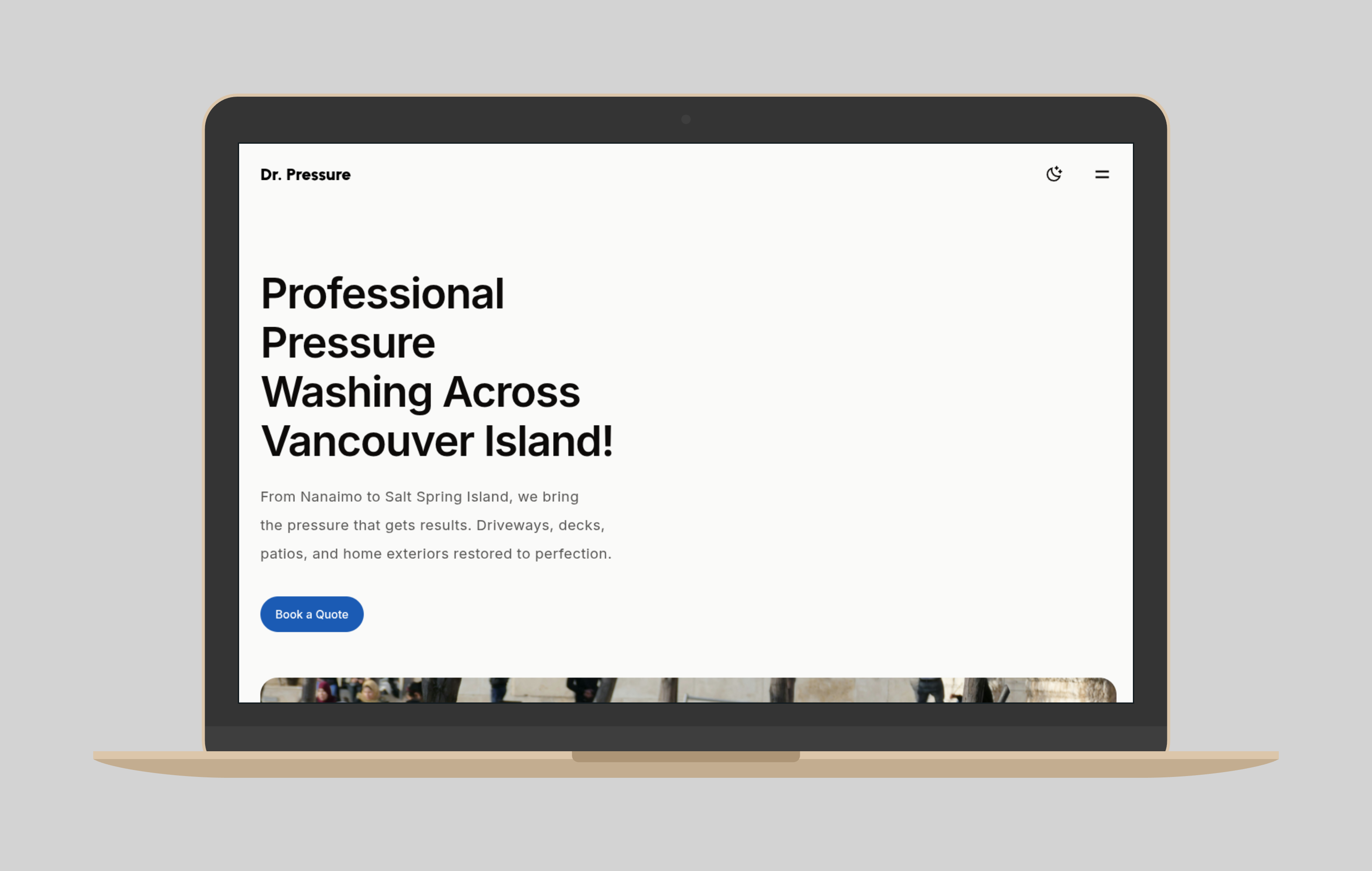
I chose Astro with the Stone theme instead of a traditional CMS because it allowed a fast static build while supporting structured content. I integrated Keystatic rather than a database-driven CMS to give the client direct content control without exposing code or hosting complexity. This reduced long-term maintenance risk and simplified handoff.
With no existing brand system, I defined the visual direction from scratch. I standardized imagery for browser performance, applied a restrained color system using a 90-10 ratio to reduce visual noise, and selected typography optimized for readability across mobile and desktop. These decisions prioritized clarity and consistency over decorative branding.
The final result was a responsive, SEO-ready site with editable testimonials and reviews that the client could manage independently. Post-handoff maintenance requirements were eliminated, and the site structure supported future content additions without developer intervention.
In retrospect, Astro and Keystatic introduced friction during client delivery due to onboarding overhead. For future small business projects with limited client availability, I would favor platforms with more familiar content workflows to reduce delivery time while preserving client autonomy.