Project: Caesar Cipher
A Caesar cipher, is a simple text transformation that shifts letters in the alphabet by a fixed number. The goal was to correctly shift letters while preserving case and leaving non-letter characters unchanged. This project is part of The Odin Project learning program, which focuses on practical programming exercises. At the time, I was still building core programming foundations, so the focus was on understanding how characters behave at a low level rather than using prebuilt solutions.
The requirements were clear. Implement a Caesar cipher that accepts a string and a shift value, applies a right shift, converts characters to numeric values, and wraps correctly within the alphabet. With help from a coding session I attend at Maple Coding, edge cases were added so the cipher handles uppercase and lowercase letters separately and supports configurable positive and negative shift values.
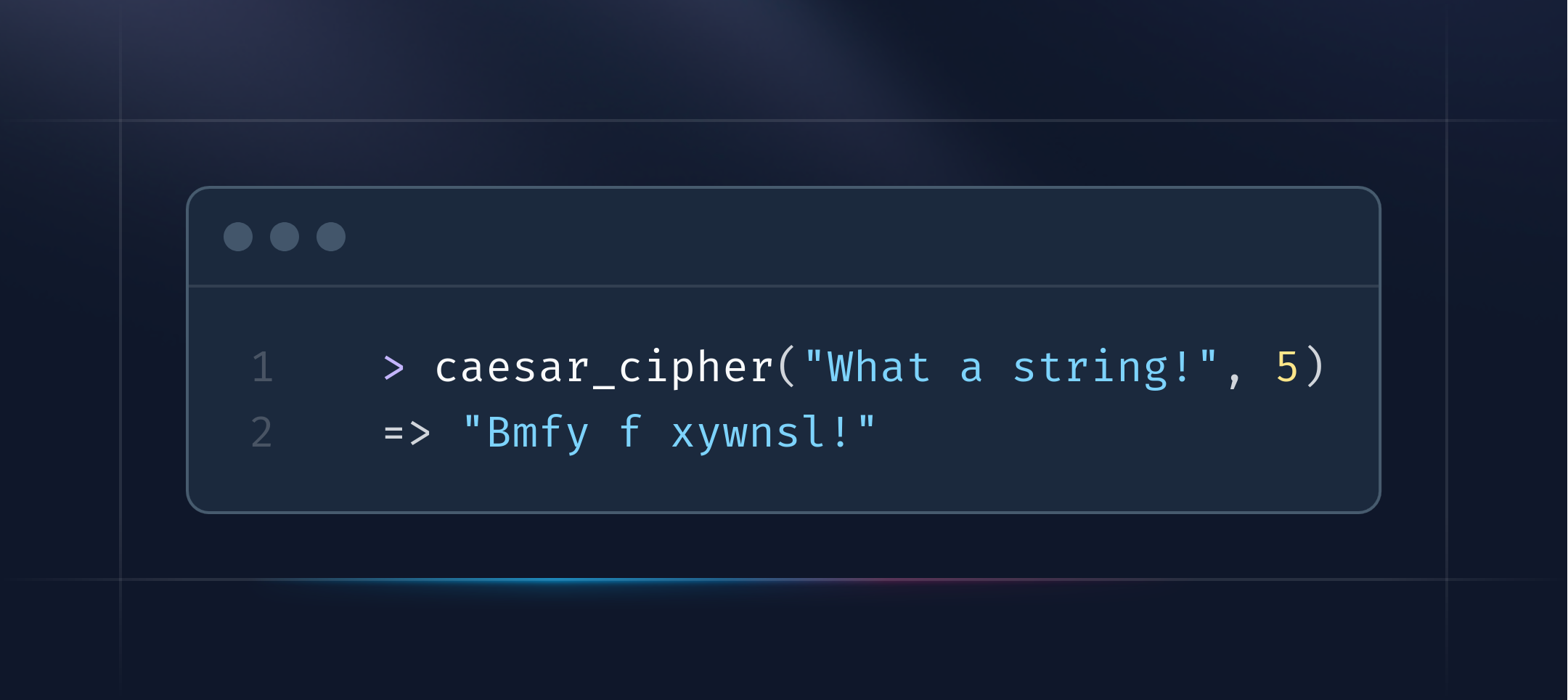
 > caesar_cipher("What a string!", 5)
 => "Bmfy f xywnsl!"
To meet these requirements, each character was processed individually. Characters were converted to their numeric values and checked to determine whether they fell within the uppercase or lowercase letter ranges. The shift was applied, and when a value exceeded the alphabet limit, it was wrapped by subtracting 26. Characters outside letter ranges were returned unchanged. The processed characters were then combined back into a single string. The final result reliably shifts text while preserving readability and structure. Inputs containing mixed case and symbols behave predictably, and edge cases at the end of the alphabet are handled correctly.
This project reinforced the importance of handling edge cases explicitly. Defining character ranges and wraparound behaviour in advance made the cipher predictable and easier to debug. Working through the problem with other developers also helped surface edge cases earlier and led to clearer implementation decisions.