Personal Website
This project focused on designing and building a personal website intended to support hiring evaluation. The primary goal was to present work clearly, reduce cognitive load for reviewers, and make both design and front-end development skills easy to assess. A key constraint was conflicting expectations around what a “proper” portfolio should contain. Rather than optimizing for polish or novelty, the site prioritizes clarity, structure, and role alignment, particularly at a junior-to-mid level.
The current version reflects a deliberate shift in positioning toward UI design and front-end development. Earlier iterations were preserved under subdomains to track progression, while the latest version consolidates experience into a single, focused presentation. To address the dual nature of design and development work, the interface includes a toggle that allows users to switch between designer and developer views. Each view emphasizes different skills while maintaining a consistent structure, allowing reviewers to evaluate either discipline without friction.
Visual direction and interaction design were informed by the idea of dual identities under one system, translated into a clear, accessible interface. The dual-view concept was inspired by the video game Final Fantasy Dissidia on the PlayStation Portable, which centers on contrasting identities within a single system. Color and layout choices were adapted to meet accessibility and modern web standards.
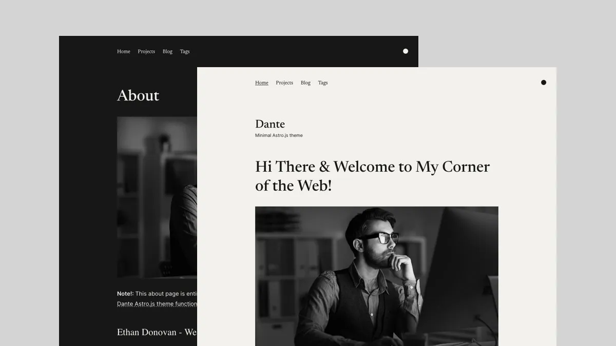
For implementation, the Dante theme by Just Good UI was selected to support performance, accessibility, and maintainability. This allowed effort to be focused on information architecture, content structure, and interface decisions rather than rebuilding common patterns. Key technical characteristics include a mobile-first responsive layout, light and dark mode support, fast load times using Astro with optimized assets, Tailwind CSS for consistent styling, and Markdown/MDX for maintainable content.
The result is a site that enables quick evaluation, supports scanning over reading, and balances design intent with technical execution. Treating the website as a tool for reviewers rather than a personal showcase led to clearer structure and stronger signal.